When you click on links to various merchants on this site and make a purchase, this can result in this site earning a commission. Affiliate programs and affiliations include, but are not limited to, the eBay Partner Network.
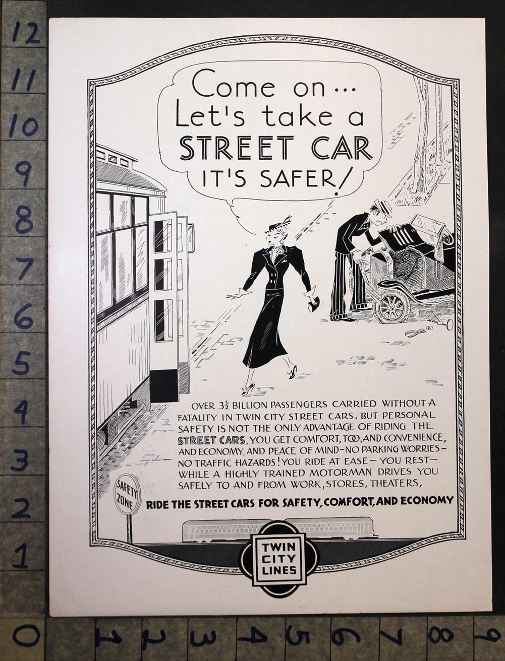
DATE OF THIS**ORIGINAL** ILLUSTRATED COVER, ADVERT, PRINT:1936
THIS ITEM IS A ONE-PAGEADVERTISEMENT OR PRINT. IT IS FROMANORIGINALPERIODICAL.THEREIS ONEPHOTO,SO PLEASELOOK OVER CAREFULLY FOR SIZE AND CONDITION! NOTE: SOME PHOTOS MAY HAVE A BLACK BOX COVERING UP THE NAME OF THE PERIODICAL - IT IS ONLY LAYING ON TOP OF THE ITEM - NOT PERMANENT. ENJOY!
SPECIALIZED INFORMATION ABOUT THE ITEM:
The 1936 Twin City Lines advertisement featuring a comic by M. Burwick is a classic piece of mid-1930s regional transit marketing. Commissioned by the Twin City Rapid Transit Company (TCRT)—which operated the massive streetcar network connecting Minneapolis and St. Paul, Minnesota—this print campaign ran in local newspapers to encourage streetcar ridership over driving. 1. The Core Marketing StrategyBy 1936, the growing popularity of personal automobiles was severely hurting public transit revenues. To combat this, Twin City Lines launched a series of lighthearted, illustrative comic advertisements aimed at shifting public perception. The ads used relatable, everyday humor to position the trolley as a smarter, more relaxed, and more economical alternative to navigating traffic and harsh Minnesota winters. 2. The Style and Comic Art of M. BurwickM. Burwick’s illustration style was characteristic of the standard single-panel and short-strip \"gag\" comics popular in 1930s newspapers.
Relatability: The comic focused on standard archetypes of the era—stressed motorists, busy commuters, and neighborhood families—making the visual argument instantly recognizable to local readers.- The \"Coolest Place\" Theme: A recurring theme in Twin City Lines\' mid-1930s illustrated ads was the physical comfort of the ride. In summer, they pushed the tagline \"The coolest place on the street is in a streetcar,\" while winter ads focused on escaping the stress of driving on icy, snow-packed streets.
- Visual Framing: Burwick\'s characters were drawn with expressive, exaggerated features to emphasize the contrast between the absolute frustration of owning a car (dealing with flat tires, parking, and traffic) and the carefree ease of reading a newspaper on a streetcar.
3. Historical SignificanceThis advertisement represents the golden age of TCRT\'s public relations campaigns before the system was ultimately dismantled in 1954. Today, original newspaper clippings of these Burwick-illustrated transit comics are highly valued by Minnesota historians and vintage transit collectors for their distinct Great Depression-era graphic design and localized cultural commentary.If you would like to explore this era of transit history further, let me know if you want to look into:
Other major Twin City Lines advertising taglines from the 1930s and 1940s- The Minnesota Streetcar Museum\'s archives regarding vintage TCRT illustrations
- How the introduction of PCC streetcars in the late 1930s changed their marketing focus
While historical records on the exact biographical footprint of M. Burwick are scarce today, the signature remains highly recognized by transit historians for a specific contribution to Minnesota cartooning and industrial history.During the mid-1930s, the artist worked directly as a commercial illustrator and gag cartoonist for the Twin City Rapid Transit Company (TCRT).1. Style and Creative RoleBurwick\'s work was defined by a classic, expressive, single-panel and short-strip cartoon style popular in Depression-era newspapers. Rather than signing under a full name, the artist consistently used the simple, distinct signature \"M. Burwick\" in the corner of every panel. The illustration style heavily mirrored the humorous, conversational \"street slice-of-life\" tone pioneered by national syndicates at the time.2. Crafting the Twin City Rapid Transit NarrativeTCRT hired Burwick to humanize public transportation at a time when automobile sales were beginning to pull passengers away from streetcars. Burwick’s cartoons served a highly targeted purpose:
The Pity of the Motorist: Burwick frequently drew characters who chose to drive their personal cars, depicting them as completely stressed out, sweating over engine trouble, tracking down rare parking spaces, or battling icy Minnesota blizzards.- The Comfort of the Trolley: In contrast, Burwick drew the streetcar riders as relaxed, smiling, and casually reading the daily paper, reinforcing the transit company\'s economic message.
Because many of these illustrations ran exclusively as temporary newspaper ads and local broadsides, original syndication details regarding Burwick\'s life outside of the 1936 TCRT campaign remain largely preserved within localized archives, such as the Minnesota Historical Society and the Minnesota Streetcar Museum.
ILLUSTRATOR,ARTIST, PHOTOGRPAHER OR UNKNOWN (IF BLANK):
ADVERTSIZE:SEE RULER SIDES IN PHOTO FOR DIMENSIONS ( ALL DIMENSIONS IN INCHES)
**For multiple purchases please wait forour combined invoice.Shipping discountareONLYavailable with this method. Thank You.
At BRANCHWATER BOOKS we look for rare & unusual ADVERTISING, COVERS + PRINTS of commercial graphics from throughout the world.
Our AD\'s and COVER\'Sare ORIGINAL and 100% guaranteed --- (we code all our items to insure authenticity) ---- we stand behind this.
IF YOU WISH TO PURCHASE A RE-MASTERED COPY PLEASE SEE \"MODERN POSTERS\" IN OUR \"POSTERPRINTARTSTORE\" STORE.
As graphic collectors ourselves, we take great pride in doing the best job we can to preserve and extend the wonderful historic graphics of the past.
PLEASE LOOK AT OUR PHOTO CLOSELY ASIT IS (ALBEIT LOWER RESOLUTION) THE PRODUCT BEING SOLD.....NOT STOCK IMAGES
**NOTE** : PAGES MAY SHOW AGE WEAR AND IMPERFECTIONS TO MARGINS, WITH CLOSED NICKS AND CUTS, WHICH DO NOT AFFECT AD IMAGE OR TEXT WHEN MATTED AND FRAMED. SOMETIMES THE PAGES HAVE BEEN TRIMMED.. PLEASE NOTE THE ACTUAL SIZE OF SELLING AD IN THE ATTACHED PHOTO IMAGE... WHAT YOU SEE IS WHAT YOU GET...
Weship viaUnited States Postal Service.We have a3 day handling time not including weekends or holidays but normally we have all orders processed, packed and shipped within 48 hrs.
A Note to our international buyers (Including Canada). Please read before placing a offer or buying an item:
**Import taxes, duties and charges are not included in the item price or shipping charges. These charges are the buyer\'s responsibility. Please check with your country\'s customs office to determine what these additional costs will be prior to offerding/buying on items. These charges are normally collected by the shipping company or when you pick the item up,this is not anadditionalshipping charge. We are not responsible for shipping times to international buyer\'s. Your country\'s customs may hold the package for a month or more.
**We pride ourselves on quality products, great service, accurate gradationsand fast shipping.**
BRANCHWATER BOOKS
YOUR AD WILL BE SHIPPED ROLLED IN APROTECTIVE PLASTIC BAG INAN 80mm (TWICE USPSRECOMMENDED) THICK, 2 INCHESIN DIAMETER (SO AS NOT TO STRESS THE PAPER)SHIPPING TUBE WITH PRESS TIGHT PLASTIC END CAPS.
Powered by SixBit\'s eCommerce Solution